Vivid Sydney app

Vivid Sydney app

Vivid Sydney app

Light, Music and Ideas festival

Brief

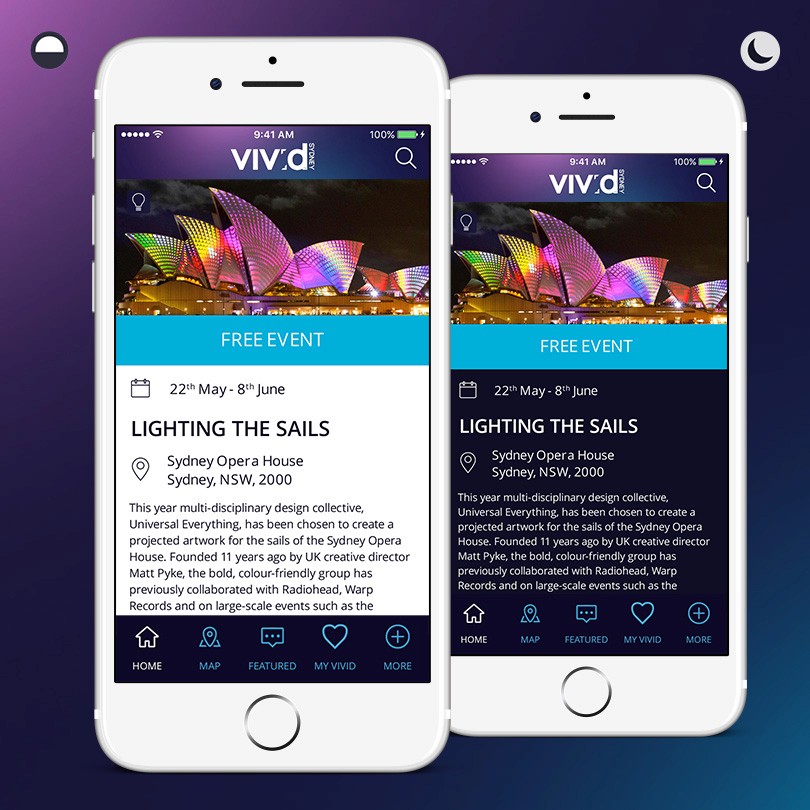
Make the VIVID Sydney app more spectacular and easier to use. The app combines all the information Vivid Sydney has to offer in one easy to use application.

Approach

We had the unique opportunity to put forward concepts on how we envisioned the next iteration of the Vivid Sydney app. We had a few days to respond with a pitch presentation, so we quickly ideated around new app features and assessed the latest trends in app UI and interaction design. Wireframes were sketched before developing an evolution to VIVID Sydney’s digital visual identity and a series of screens were finalised for the pitch.
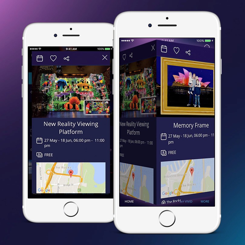
Solution

Front Page

I explored and presented two concepts for how to approach the front page of the app. One allowed for rapid navigation while the other surfaced content in a news feed to increase targeting and discoverability. The final design used a combination of the two.

My Vivid

Creating a My Vivid account empowered users to plan what events they were going to attend.

My Trails

Trails promoted precincts across Sydney and guided users to what to see and do in one night.

Content

A rich news feed kept users on the pulse and the introduction of gesture driven transitions made content more engaging. We introduced an iconography to replace images in offline mode. It was common for users to plan throughout the day and use the app during the event at night. To make the app more usable we introduced day & night modes to make it easier for users to digest content no matter what time of day.

Result

Drifter was successful in the pitch.