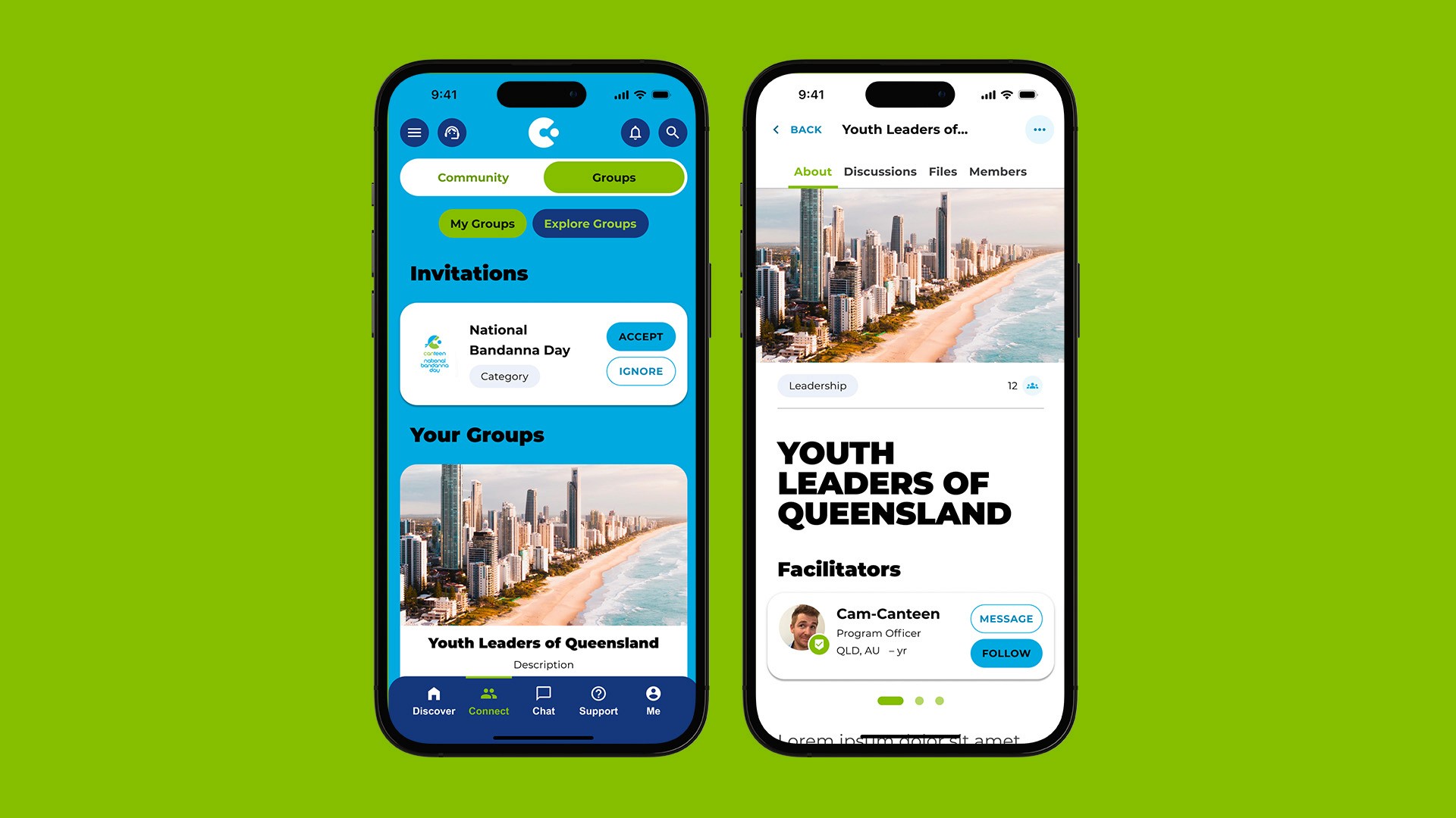
A social platform for young people impacted by cancer
Client: Canteen | Company: whiteGREY
Background
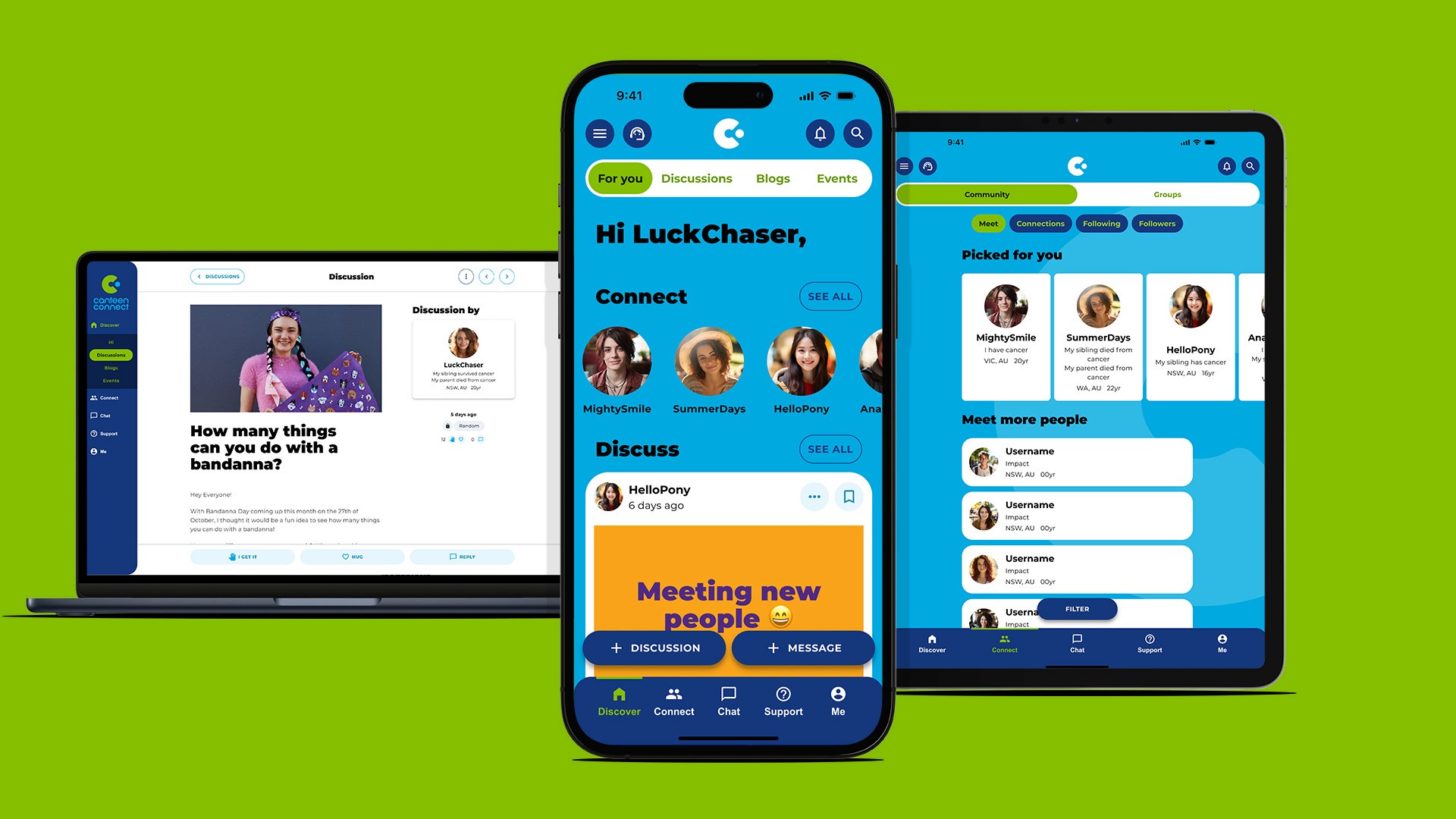
Canteen is an organization dedicated to supporting young people affected by cancer. Canteen Connect, their social app and web platform, serves as a hub where these young people can openly discuss their experiences, chat with counsellors, message other members, find nearby events, read tips and stories, and participate in groups. However, after years without design review, new features had been added without UX/UI input, leading to a disjointed user experience.
Brief
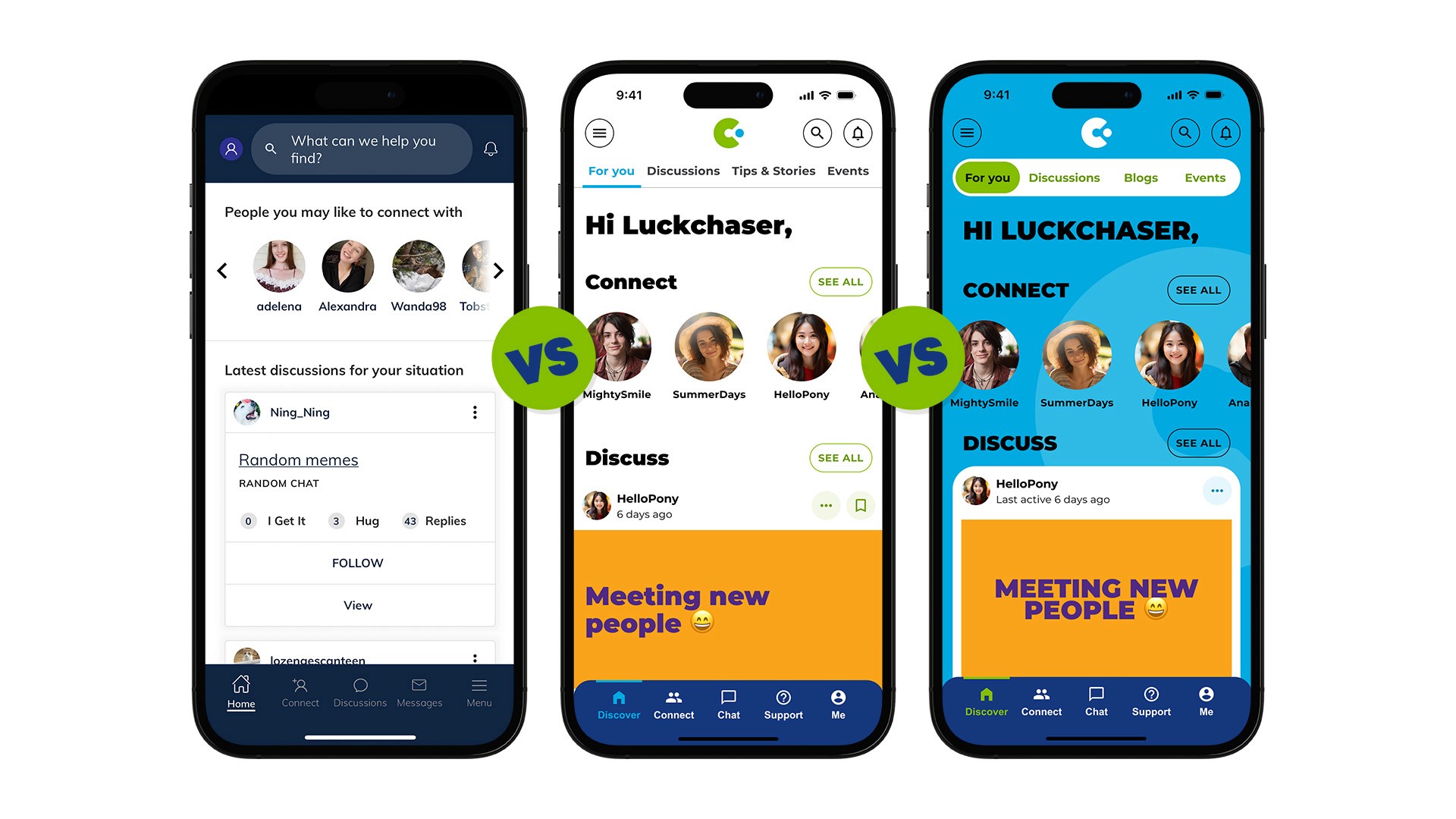
Our task was to improve the UX and UI of Canteen Connect, focusing on key problem areas identified through research: difficulty in navigation, an outdated appearance, inefficient layouts, user feedback on layout issues, problems with thread refreshing, and the challenge of locating the chat button.
Difficulty in navigation
Clunky experience
Outdated appearance
Hidden features
Inefficient layouts
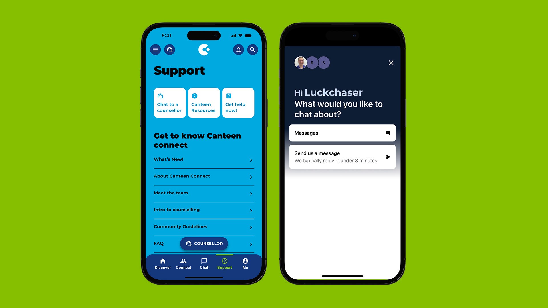
Trouble locating chat
Approach
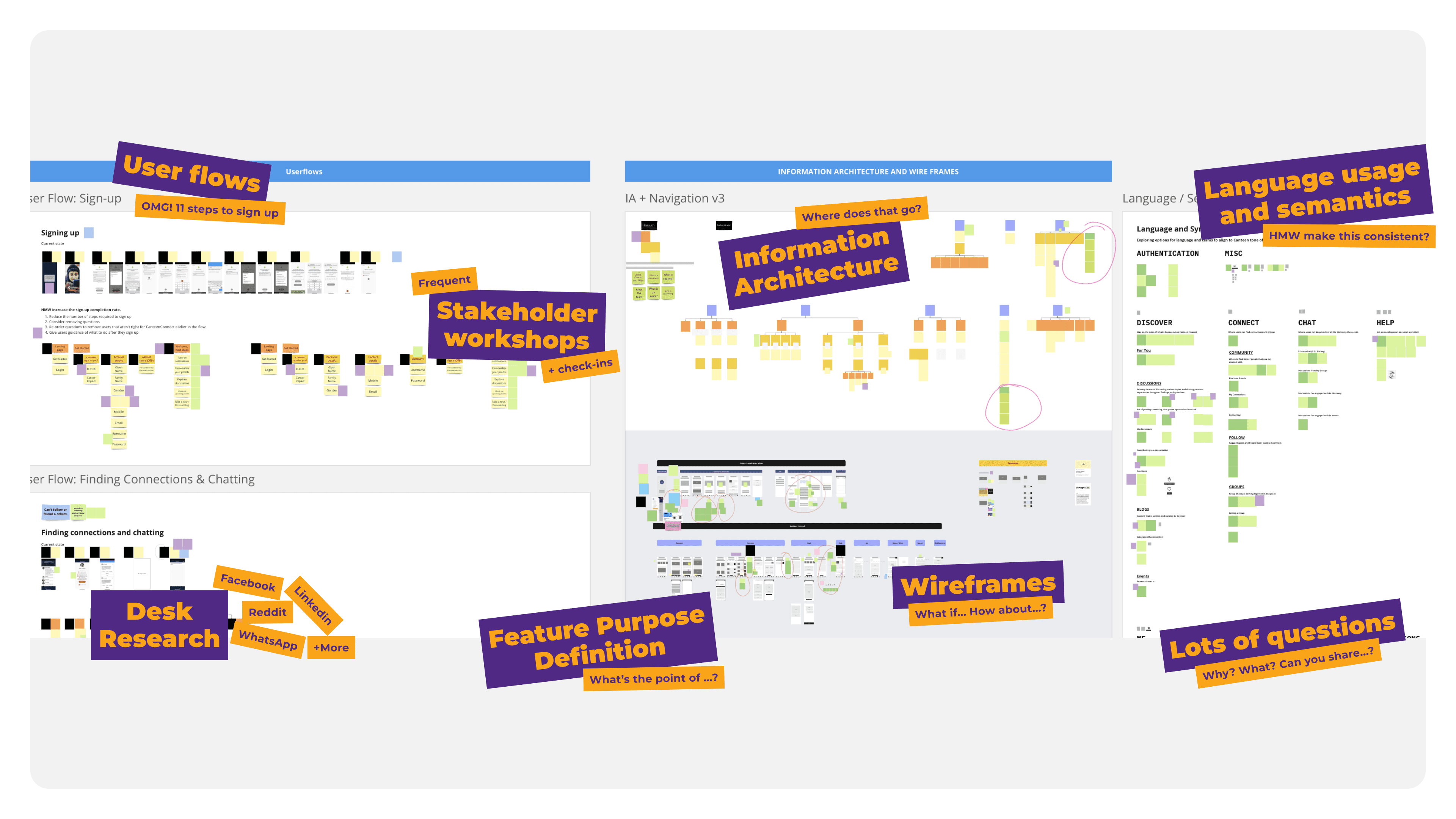
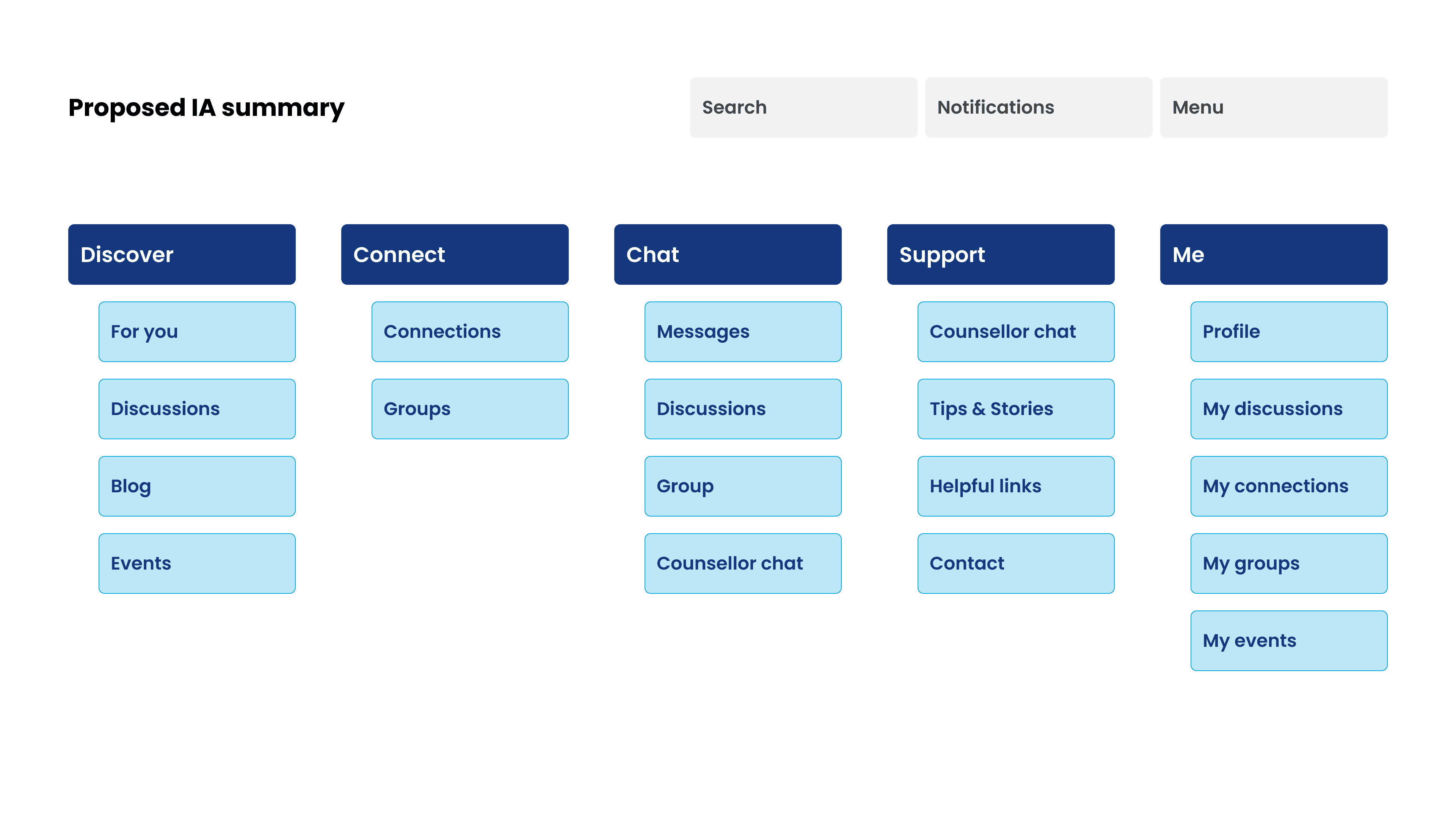
We started by creating a project plan that outlined all necessary activities to deliver a finished design recommendation. This included an audit of the existing app, mapping key flows, navigation IA, and language usage. We conducted desk research to understand the competitive landscape and used the existing research to obtain insights while creating new user journeys and IA, organizing content into action-oriented buckets and simplifying flows.
Visual design
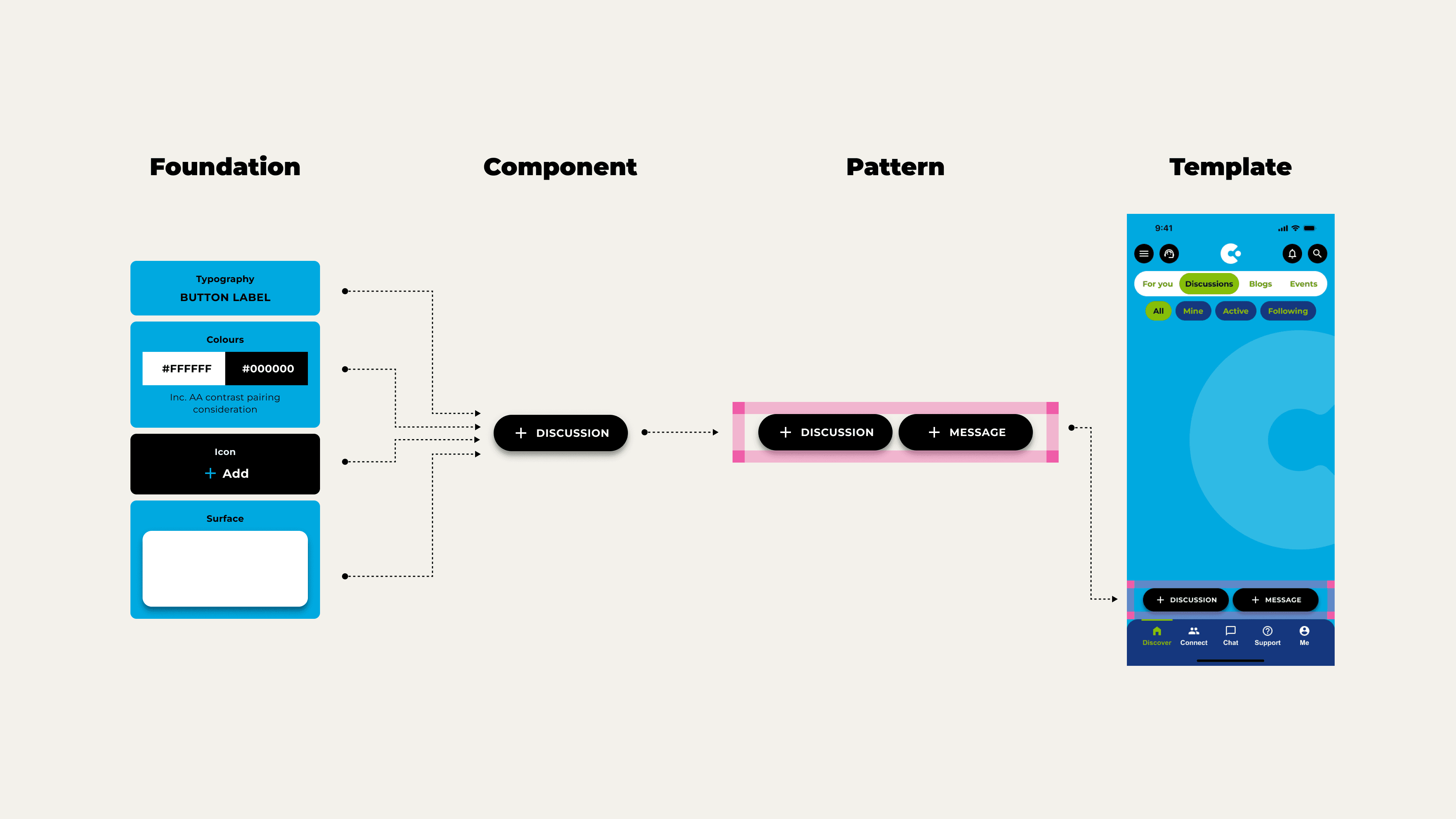
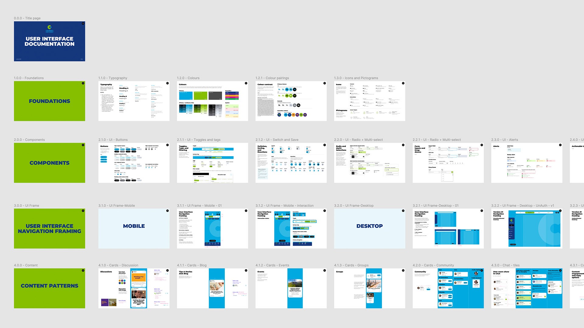
Low-fidelity wireframes for key pages were developed to capture the requirements of each page before moving into design. We established a design system with simple foundations and components that could accommodate two visual look and feel directions, allowing for rapid rollout.
Prototyping and Testing
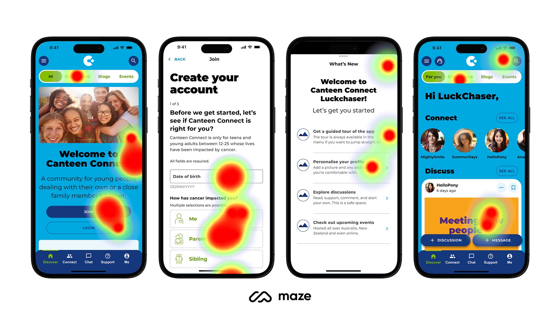
High-fidelity designs and prototypes were created, and we conducted user interviews and unmoderated tests using Maze to validate our UX hypothesis and gather community input on the preferred visual direction.
Solution
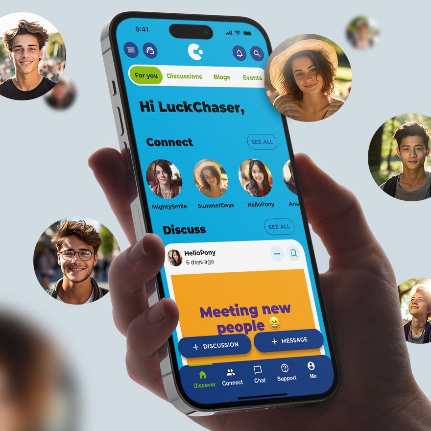
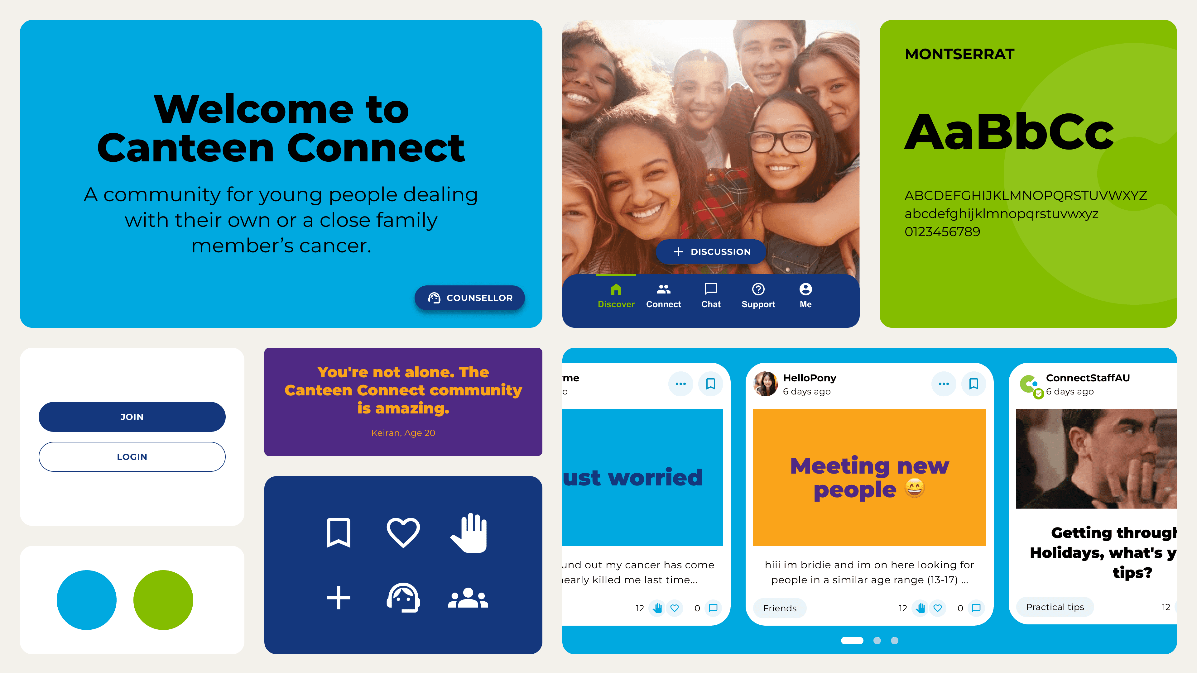
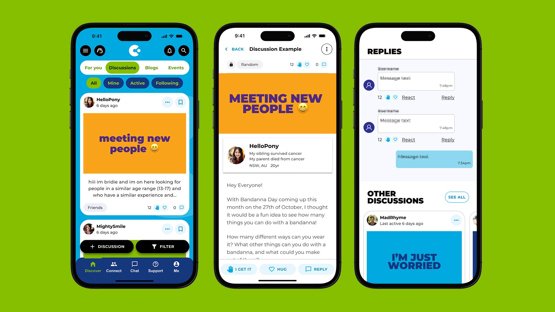
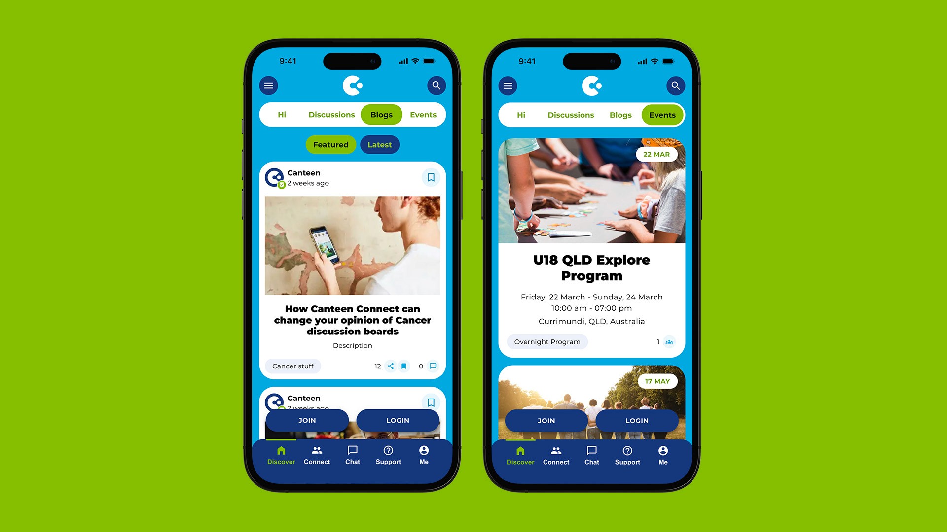
Redesigned discussions to be visually inviting, promoting greater engagement and participation.
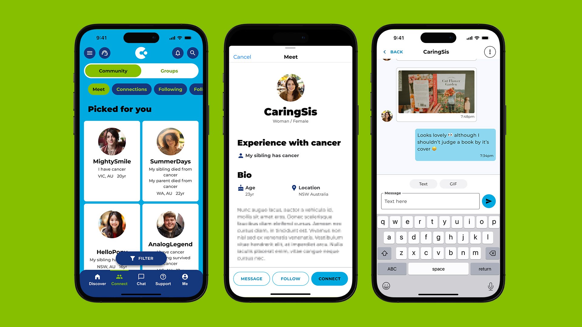
Allowing users to connect with and follow peers, fostering lasting connections.
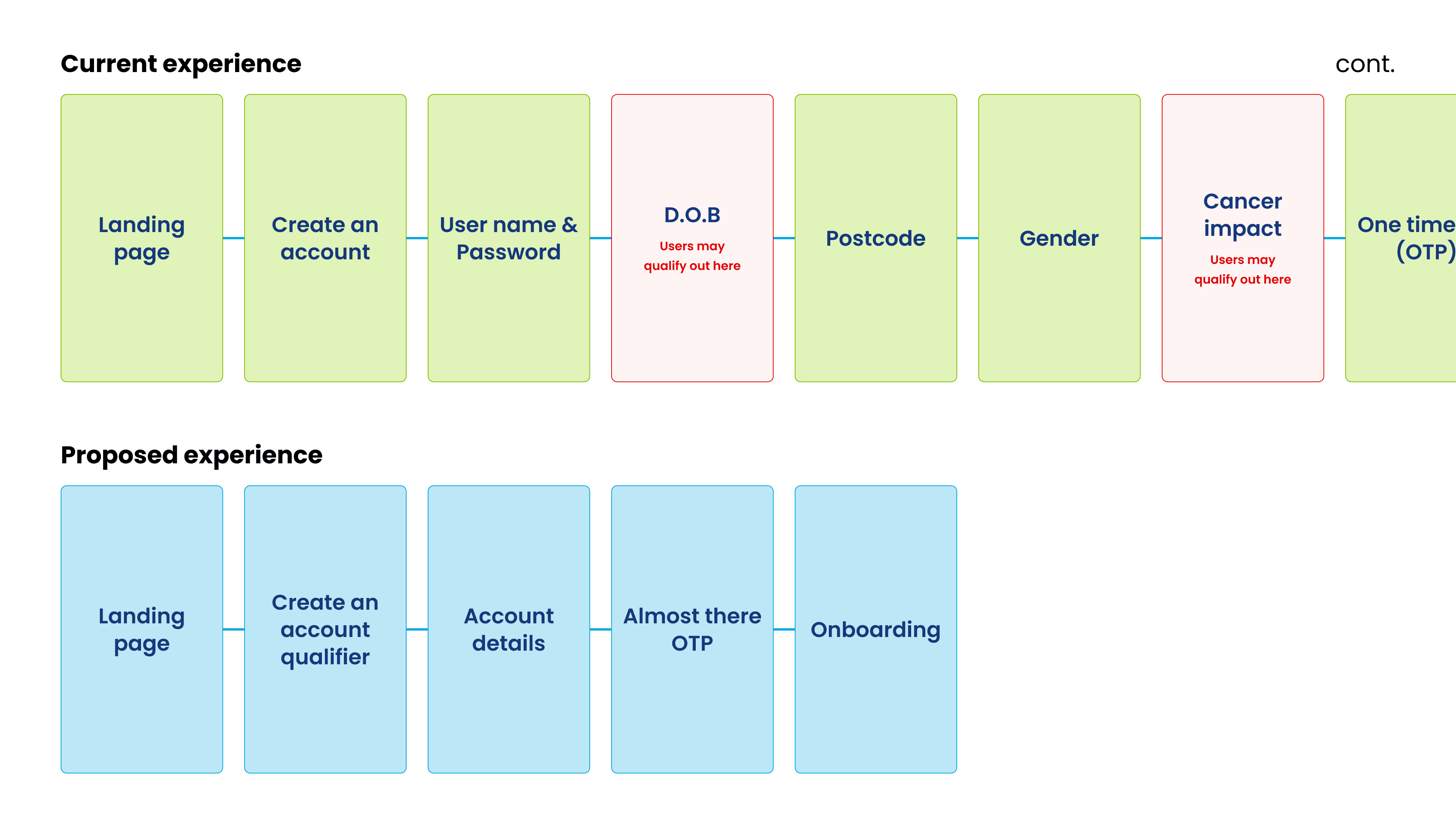
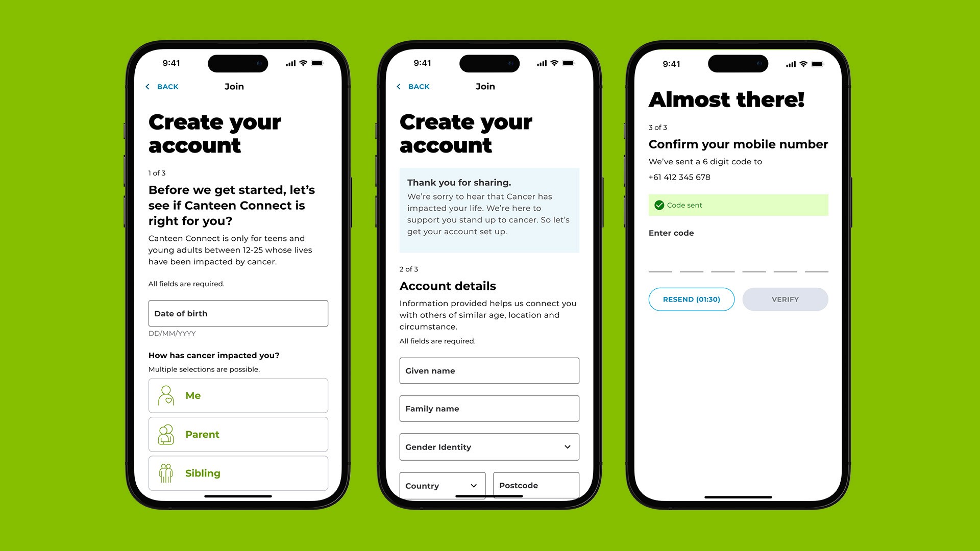
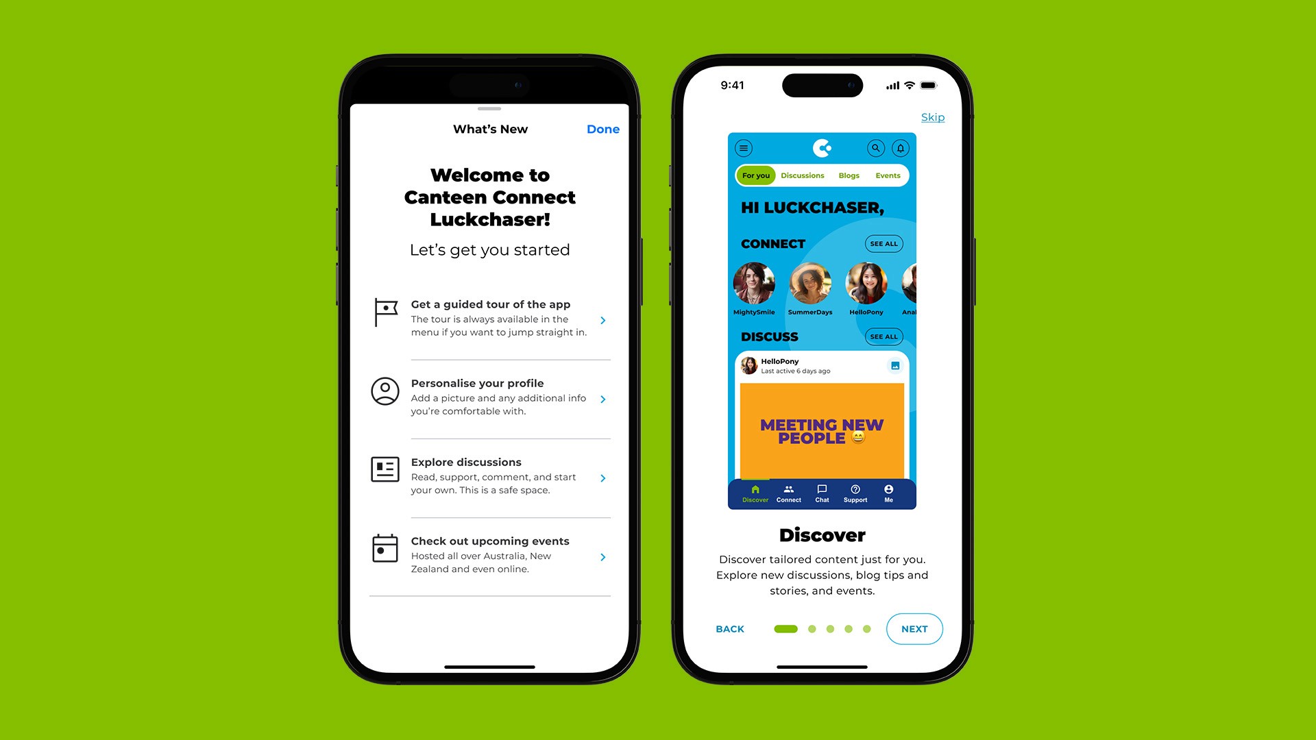
Accelerated sign-up by filtering out unqualified users (e.g., too old or young) earlier in the process, reducing frustration. We reframed questions to be more empathetic and relevant, cutting the steps from 11 to 3 and introducing a smoother onboarding experience.
Other features
Results
In just two months, I delivered a comprehensive redesign of the Canteen Connect platform, packed with user-centric features. Our testing validated key hypotheses with excited reactions, providing a clear design direction and identifying areas for further improvement. While the redesign is still pending implementation, we anticipate positive reactions from the young people who rely on the platform.
